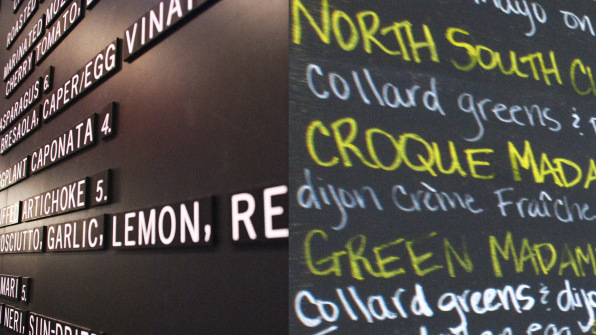
It’s easy to love that little cafe in your city–you know the one. The tables are too cramped. The prices are too high. The scallops are too done. And the handwritten menus are downright illegible in the soft glow of candlelight. But it has so much soul! You can feel the love!
You may be getting seduced by typography. New research out of University of Ohio and Pennsylvania State University suggests something that might sound like common sense to most designers: A handwritten menu is more endearing than a typed one. And it can create a halo effect that doesn’t just make people like a restaurant; it may make them more likely to share their restaurant experience on social media and even perceive the food as healthier.
Over the course of two trials, testing hundreds of people on Amazon’s Mechanical Turk, subjects were asked to imagine themselves having dinner at two different fictional restaurants.

After imagining the meal, subjects answered a questionnaire regarding their feelings about the menu, the healthiness of the brand, the social media appeal, and the human touch they felt. The questionnaire was then run through a rigorous statistical analysis to deconstruct how these responses might be interdependent.
What the study discovered was fascinating. People who received the handwritten menu believed that the healthy version of Rilo’s was, well, healthier, than when it was presented in Helvetica. They also just liked the menu more, and imagined sharing more about it on social. In fact, people even believed that restaurant was somehow serving “love.”
But there was a twist–and it demonstrates how companies can backfire when a brand overreaches.
Subjects who were presented with the totally normal, non-seasonal local version of Rilo’s that used a handwritten menu actually reacted negatively to Rilo’s in some ways. They believed the menu was less healthy when it was handwritten than when typed. And they were less likely to post about it on social.
But why? If the handwritten typeface created a sense of love at one restaurant, shouldn’t it create a sense of love at every restaurant? After all, the researchers argue that there’s a pretty straightforward psychological workflow happening when the handwritten menus work. It looks like this:
Handwritten typeface ➔ a sense of human touch ➔ perception that love is symbolically imbued in the menu offerings ➔ a series of favorable consumer responses including attitude toward the menu, perceived healthiness, and social media engagement.
However, the researchers argue that you need a baseline–an explicit seed of messaging that’s been planted with the consumer in the first place to make handwriting feel appropriate. Without it, the effort will backfire, and essentially call attention to its own artifice.
“Simply writing ‘Big Mac’ in handwritten typeface is not able to make ‘Big Mac; to be perceived as containing love or influence consumers’ evaluations of McDonald’s. In order to enjoy the handwritten typeface effect, the restaurant must make its health-focused brand image salient to consumers,” the researchers write.
If nothing else, the study offers yet another piece of evidence that a brand spans far beyond graphic design, deep into the experience of a place or product, and all the way into its actual mission. And if all that isn’t aligned, something will taste off to the consumer.
0 Comments:
Post a Comment